Bauhaus
Peter Keler

I personally dislike Bauhaus, I think that the colours are gaudy and the shapes ugly. That's not to say that I hate it though. The design of this cradle for example, although I find it hideous, has some interesting shapes like the circular rockers and the triangular cradle. Yet dispite the alterations, the cradle is still functional. This challenges you to think of ways to experiment with an existing object's design. Its weird but completely unique, and the design is contemporary far beyond its years.
Marcel Breuer

Marcel Breuer is another artist from the Bauhaus school, but this design I like a lot more. I think that the materials used work well together: wood, stone and glass. The design, once again, is modern but the shapes seem to interact better. I like how, because they are layered on top of one another, the house appears to float.
Thomas Heatherwick
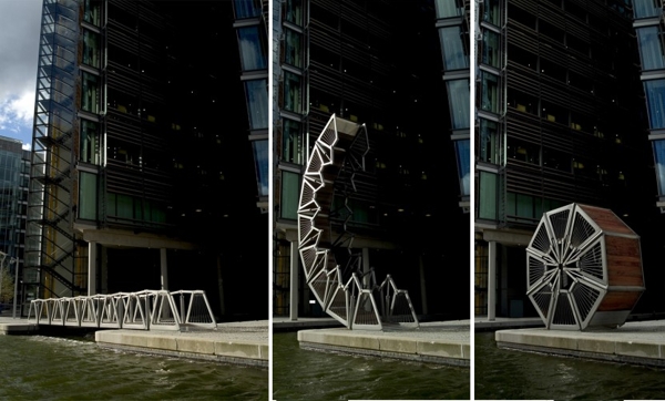

I love Thomas Heatherwick's work, as well as being functional it is also beautiful. The bridge, for example, works perfectly for the purpose it was built for, but it is eye-catching and creative. Curves and layering seem to be a common theme and it is what makes his work look so complex and the scale of his projects can range from small to enormous. This is not something that could I implement into 3-D design myself but the curves and colours would be good to include in sketches.
Ingo Maurer


Light fittings are usually quite plain in design, they may have a pattern printed on or different texures used but they are still the same conical shape as any other light shade. But, by ignoring typical ideas and designing around the light you are no longer limited to one shape. Ingo Maurer has allowed his designs to become free and creative because he has not confined himself to the standard shape of a lamp shade. This is something that can be applied to any area, not just 3-D design. The works themselves are amazing, they're so mad and beautiful. They look like a work of fine art rather than a light shade, its not something that could be fitted in everyone's home.
Frank Gehry

Known as the Dancing House, this building seems to exude movement. Great skill has been put into the curves to the appearance of a swaying motion, like that of a dancer. Its ultra modern design is emphasised by the traditional building sitting next to it. And whereas the other building 'sits' the dancing house morphs and changes going against the tradition of static buildings. I love this sleek fluid look.
Moshe Safdie

Habitat 67 is made up of simple cubes layered and slotted together. It just looks like so much fun to live in as well as to design. They remind me of sort of houses you build from Lego blocks as a kid. Everything about it looks completely random and mishapen yet it is just a similar design repeated and rotated over and over. They also remind of mountain side villages where all the houses are clustered together, it seems like it would promote a close, tight knit community which makes the buildings appear warm and friendly.
No comments:
Post a Comment