Stefan Sagmeister

The typography is quirky and works well the graphics. The type is simple and sans serif and suits the silly, informal graphics. What I really like about it is the inclusion of the image with the type, how the chicken's feet have been used to create the letters. The type then becomes unique.
Wim Crouwel

The type looks similar to something from a digital watch giving it a contemporary feel. It suits the subject and I think its clever how the letters have highlighted to spell out the word 'vote'.
Alan Fletcher

I love this. I love the colours, the shapes and the type. Its such a simple idea but it works so well and could be used with more than just typography. The colour are very subtle but they complement each other. This style of typography would be useful to bear in mind for my specialism.
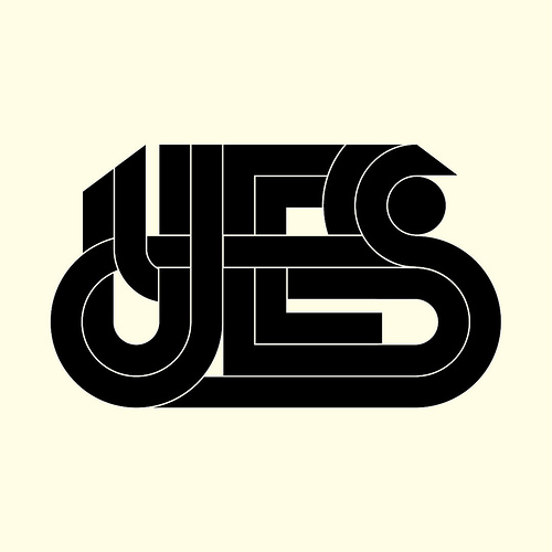
Kris Sowersby
Pep Carrio

The image on the right is the one I really like, it has a clear layout and interesting type. I really like the sort of sepia tone used as it gives a nostalgic feel in contrast with the word 'easy's type which is much more modern. The image on the left on the other hand is messy, with type all over the place and no clear boundaries. I do like the different styles of type though.
Noma Bar

This is really cute and clever. The graphics are so minimal and I love how they have been manipulated to form a pig's face. Even though it is not the sort of style I would chose I still enjoy looking at this and I appreciate how uncluttered it is. A simple style is useful for communication.
No comments:
Post a Comment