Sunday, 14 October 2012

3-D Designers

Bauhaus

Peter Keler


I personally dislike Bauhaus, I think that the colours are gaudy and the shapes ugly. That's not to say that I hate it though. The design of this cradle for example, although I find it hideous, has some interesting shapes like the circular rockers and the triangular cradle. Yet dispite the alterations, the cradle is still functional. This challenges you to think of ways to experiment with an existing object's design. Its weird but completely unique, and the design is contemporary far beyond its years.

Marcel Breuer


Marcel Breuer is another artist from the Bauhaus school, but this design I like a lot more. I think that the materials used work well together: wood, stone and glass. The design, once again, is modern but the shapes seem to interact better. I like how, because they are layered on top of one another, the house appears to float.

Thomas Heatherwick
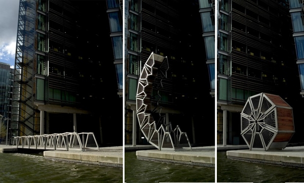


I love Thomas Heatherwick's work, as well as being functional it is also beautiful. The bridge, for example, works perfectly for the purpose it was built for, but it is eye-catching and creative. Curves and layering seem to be a common theme and it is what makes his work look so complex and the scale of his projects can range from small to enormous. This is not something that could I implement into 3-D design myself but the curves and colours would be good to include in sketches.

Ingo Maurer


Light fittings are usually quite plain in design, they may have a pattern printed on or different texures used but they are still the same conical shape as any other light shade. But, by ignoring typical ideas and designing around the light you are no longer limited to one shape. Ingo Maurer has allowed his designs to become free and creative because he has not confined himself to the standard shape of a lamp shade. This is something that can be applied to any area, not just 3-D design. The works themselves are amazing, they're so mad and beautiful. They look like a work of fine art rather than a light shade, its not something that could be fitted in everyone's home.

Frank Gehry


Known as the Dancing House, this building seems to exude movement. Great skill has been put into the curves to the appearance of a swaying motion, like that of a dancer. Its ultra modern design is emphasised by the traditional building sitting next to it. And whereas the other building 'sits' the dancing house morphs and changes going against the tradition of static buildings. I love this sleek fluid look.

Moshe Safdie


Habitat 67 is made up of simple cubes layered and slotted together. It just looks like so much fun to live in as well as to design. They remind me of sort of houses you build from Lego blocks as a kid. Everything about it looks completely random and mishapen yet it is just a similar design repeated and rotated over and over. They also remind of mountain side villages where all the houses are clustered together, it seems like it would promote a close, tight knit community which makes the buildings appear warm and friendly.

Saturday, 6 October 2012

Meadham Kirchhoff


I love the vibrant colours used, the clothes stand out and are instantly memorable. I also like how most of the clothing is almost wearable, but just enough has tweaked and altered to make it that little bit more distinct. It seems to encourage the idea to take something old and change it into something new and drastically different. The style itself reminds me a lot of lolita fashion, which is something I really like, but most the clothing has an exotic look that I find appealing. Most of all the designs are fun and playful.

Wednesday, 26 September 2012

Chesterfield Market Day


These photos were taken on market day in Chesterfield, they are taken of things that I found interesting, humorous or had bright colours or strong contrasts. What I enjoyed whilst taking these photos was finding all the strange happenings and weird cultures in such an ordinary occurence. I chose to include some of the blurrier photos because I thought that they helped capture the busy atmosphere of the market.

Tuesday, 25 September 2012

Photographers of Note: Part 3

Carrie Mae Weems


The message in this photo is clear and bold, it communicates the racist view of beauty. Carrie faces away from the woman in the mirror as she does not want to accept this. She uses aggresive text in conjunction with the image to convey the fury she feels about the treatment of black women. I like the image overall, but I feel as though the photograph could be more powerful, especially when considering the text.

Ansel Adams


The composition in this photo really suits the subject. Its good how it emphasises the wide reach of the branches. What I love most of all in this are the strange twists and turns of the tree which make it look like something from a science fiction story. The use black and white also adds drama to the stunning scene.


William Eggleston


This photo is totally bizarre, I love how random it is and how unthinkable it would be to miss out on taking a picture. I think it also relates to how any ordinary person would react upon seeing a man play a piano in a car park; instantly take a photo. The next thing to notice is the glaring sign; that harsh white light draws your eyes in like a moth to a flame and shines like a spotlight on the piano. The gritty car park gradually becomes the mans own personal stage. Overall I really just enjoy the quirkiness of this photo.

Sunday, 23 September 2012

Thorsten Brinkmann Style Photos


The pictures were taken in different lights, I prefer the first one as its much clearer to see.
   After looking at Thorsten Brinkmann's work we decided to create our own set ups. We took various scrap pieces of material and arranged them on each other in manner that resembled clothing and gave the models props.
   I enjoyed setting up ready for the shoot, I liked being able to control how the finished image would look i.e. arranging the materials, pose, choosing props etc. Due to changes in costume the pose and prop had to be changed but I still like the end piece. Feels medieval, a hunched old man on his travels, similar to how Led Zeppelin's album IV looks. I think it is a powerful stance, however, I would've liked to have used a brighter background because it is difficult to see the figure against the black. I would also have to use the original pose and prop as well. I think this is something I would like to try again in the future.

Photographers of Note: Part 2

Julia Margret Cameron


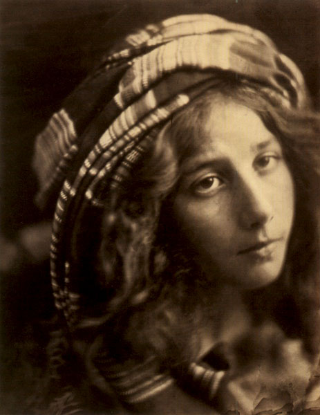
I love the soft sepia tones in this because they give a warm feel to the photograph. Even though I do not know the age of the photo, the sepia tone makes it look nostalgic and adds character to the girls face. She looks like a historic figure from someone's family tree. Altogether the image is charming and dream-like.
Henri Cartier-Bresson


This photo screams 'perfection'; the time spent preparing for exactly the right moment is incredible. It reminds me of a magician's trick, giving the illusion that the man is running on water. The composition is good, the fence separates the top third of the picture and the man is positioned on the right hand third, demonstrating the rule of thirds. There is also a sense of impending misfortune for the man as jumps ship; the viewer can clearly guess what happens next. This makes the photo light hearted and humorous.

Francesca Woodman


I find this image to be very disturbing. The woman's movements show her to be running in terror from a persuer the viewer cannot see. However, she is trapped behind the fireplace and can't escape. Upon closer inspection you can see that the woman is slightly overweight, perhaps instead of running from a physical enemy she is actually trying to escape her insecurities. This is further supported by the way she hides her face from view. The run down building works well with this idea of insecurity and fear. The photo as a whole makes the viewer feel uncomfortable.

Friday, 21 September 2012

Drawing with Light


First group attempt of drawing with light.

Second attempt.

Another group set.

Second attempt.

Sketching another person's figure.

Group sketch.

Another group sketch.

Drawing with light was certainly a fun experience, if a little dificult. Becaue you can't see the image as you're drawing it you have no idea how its going to turn out. The drawings themselves are beautiful I like how you can achieve different colours with diffirently tinted lights, they remind me of neon street signs. I think this technique is too quirky for me to use constantly but could be useful for certain situations.